Enable clients to execute their plans and buy our products through an interconnected, seamless, and consistent purchase experience.
I led the exploration into redefining Northwestern Mutual's purchase journey. Components of the journey were already in production or launched. However, a holistic end-to-end view was needed to firstly understand and align on the long-term purchase journey vision, and secondly, understand how that translates to design, which would build on the existing design within the platform and design system. The company was in the process of defining strategic objectives, so it was crucial that this work illustrated key pain points across the journey and laddered up to broader objectives.
The end-to-end experience spans many roles consisting of 100’s agents, specialists, representatives, and clients, all specialized in unique ways with different mental models and ways of working. Many representatives would re-type data across their workflows; systems that didn’t share data, processes were manual and inconsistent across individuals and teams.
This resulted in frustrated clients due to a lack of transparency and communication with their advisor, fragmented application processes, dated online payment methods, and overall a very fragmented delivery and onboarding experience for internal users and clients.
MY ROLE
Service Design, Product Design, Research, Design Strategy
THE TEAM
Alex Cheek (SXD), Amanda Surprenant (Research Lead), Emily Baron (UX)
80% APPLICATIONS REQUIRE REWORK, 30 DAY AVG CYCLE TIME, OVER 90 SYSTEMS, AND 45% OF LABOR FOCUSED ON NON-VALUE ADD ACTIVITIES.
STREAMLINING THE PURCHASE JOURNEY
Creating a cohesive purchase experience first required buy-in across the organization and senior leadership, restructuring, and an agreement on new budgeting.
The goals set forth to the executive committee included 1) partnering with the data strategy team working on multi-year planning in parallel, and 2) moving most of their outdated software to NM Connect where they could perform tasks within an interconnected platform.
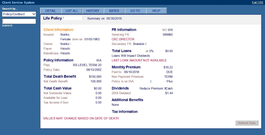
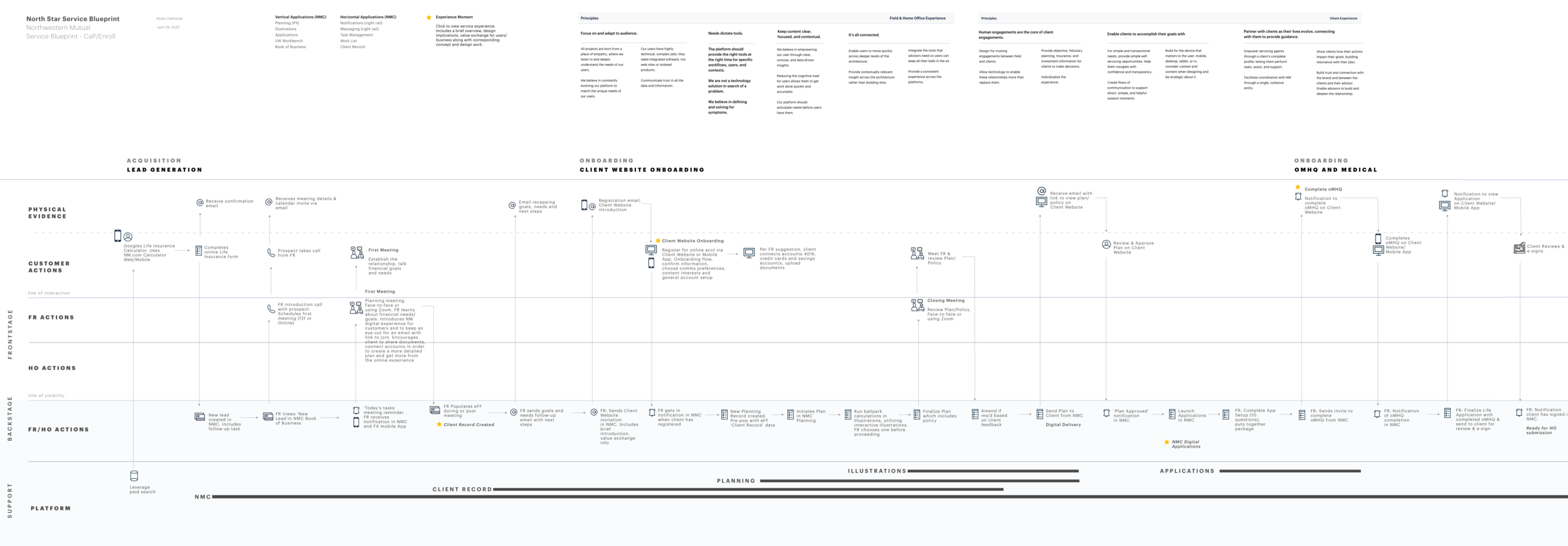
Above, multiple co-creation workshops with leaders of respective areas provided input in creating a future-state service blueprint. The experiences can be complex and difficult to orchestrate. The blueprint helped to:
1) Visualize previously intangible experiences, interconnections, and dependencies between service, technology, and operations
2) Align perspectives by providing a cross-silo view of future experiences, and
3) Prototype common flows, interaction points, and touchpoints for experience validation and help teams understand design implications.
Later, high-value experience moments within the blueprint were used as jumping-off points to bring in conceptual designs, helping teams understand the moving parts and how things connect, and how we can leverage the design already done to accelerate our work.
CONNECTING THE PURCHASE AND DIGITAL PLATFORM WILL RESULT IN -25% OPERATING BUDGET AND -75% PROCESSING TIME. AFTER DESIGNING AND LAUNCHING DIGITAL AND MODERN TOOLS, THE PURCHASE JOURNEY WILL GO FROM 0-100% END-TO-END DIGITAL, INCREASE ACCELERATED BUSINESS VOLUME FROM 12-70%, AND INCREASE AUTOMATED BUSINESS VOLUME FROM 0-70%.
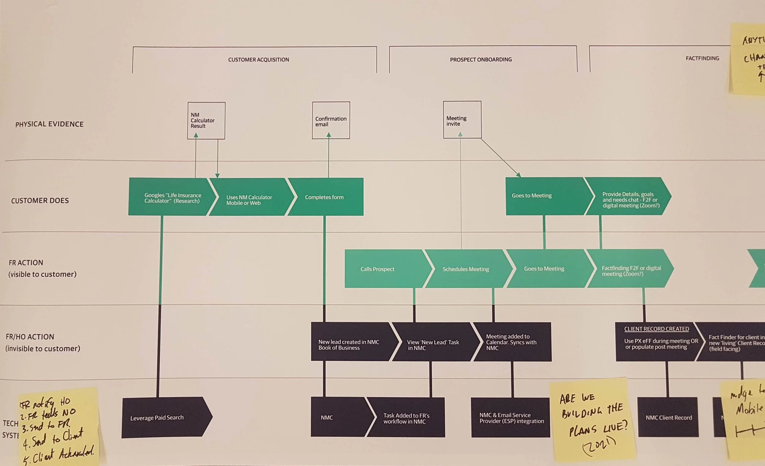
Steering a purchase journey strategy required a considerable amount of diagramming and workshopping the possibilities in the simplest possible terms. While not all-encompassing, stakeholders and senior leadership needed a clear understanding of how a great user experience and streamlined foundation, coupled with foundational platform work already done were better business strategies. Here, one of the many blueprint iterations. I collaborated across teams and siloes to ensure we were working towards a common goal, which importantly created a sense of ownership throughout the process.
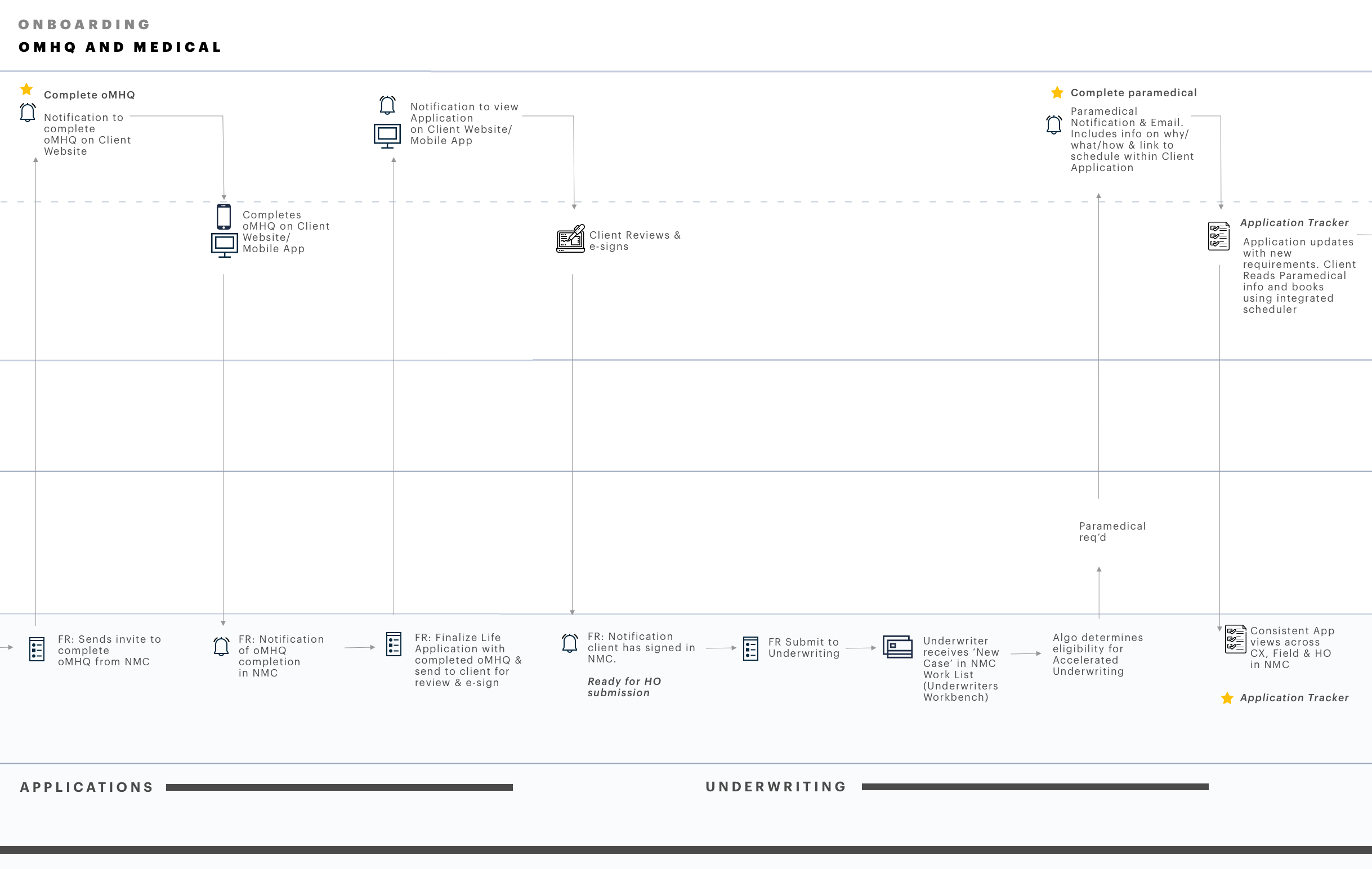
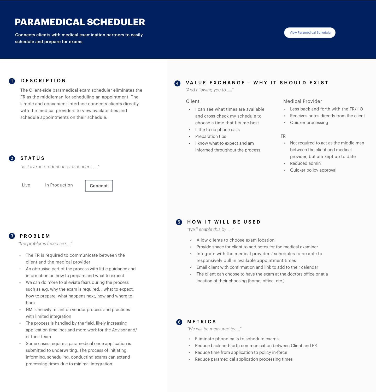
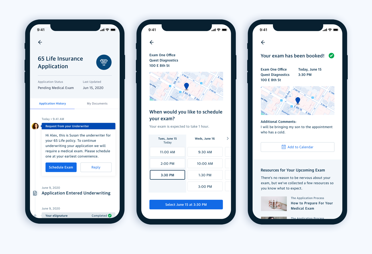
The new servicing experience had to be realized in different ways for specialized groups. Here, sub-journeys (scenarios) from the blueprint helped articulate future-state experiences. From the blueprint, I created click-down states enabling teams to view background on the intended experience including problems being solved, value-exchange, how it will be used, and potential metrics. From there, you could view a clickable prototype of the service experience.
The sub-journeys helped thread a narrative and provide tangible concepts from the blueprint through to how experiences might unfold and be used by the end-user. These jumpstarted conversations around planning between corporate strategy, product, design, engineering, and system architecture teams.
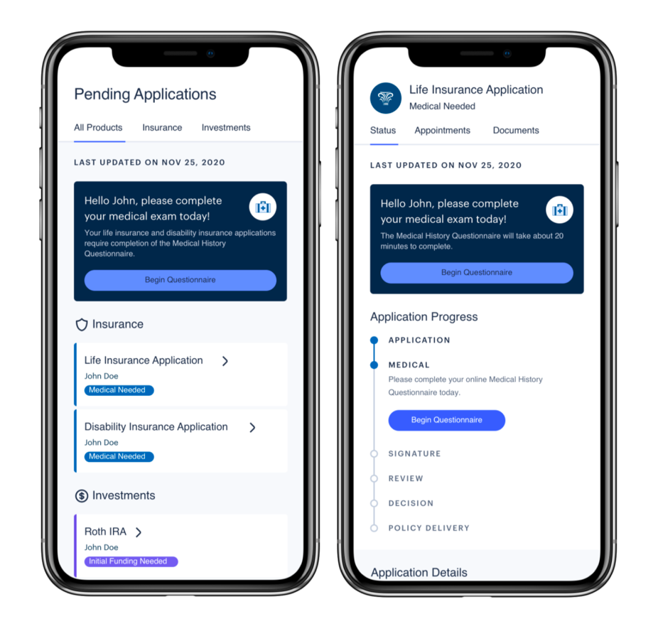
An all-encompassing application tracker for the Home Office, Field, and Clients, with detailed status, a timeline of steps completed, and clear next steps guides and provides transparency through the application process. previously, this was done in multiple legacy apps, Excel, even whiteboards, and various other tracking mechanisms. A tracker that is interconnected across the organization ensuring in-house staff, advisors, and clients have a consistent view and know where they stand.
The MVP went beyond just a tracker and explored how messaging between parties could be integrated into the workflow. It centralized everything in relation to their application such as setting expectations, notifications, updates, and next steps.
“THIS IS EXACTLY WHAT I NEED, IT’S ALL HERE IN ONE PLACE. THIS WOULD SAVE ME AND MY STAFF HOURS EACH WEEK SPENT ON CHASING UPDATES AND THE CONSTANT BACK AND FORTH WITH DIFFERENT PEOPLE IN THE HOME OFFICE. WHEN CAN WE USE THIS…..?”
FINANCIAL ADVISOR, NEW YORK, NY.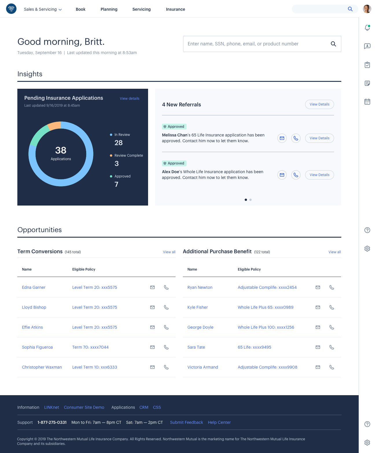
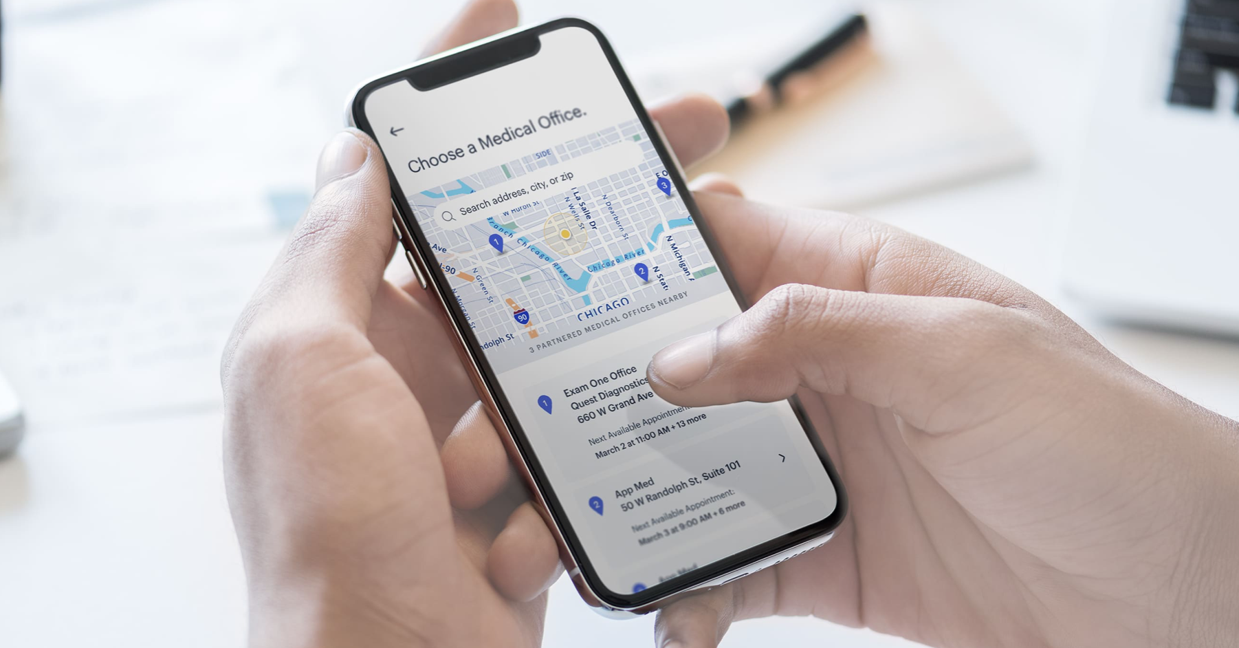
Take full control of crucial client milestones, e.g., policy approval news, with just-in-time updates right from NMC. Advisors will have the ability to deliver important policy information seamlessly and digitally.
Previously, clients would often learn their policies have been approved by someone other than their advisor or much later than they should be. Serving the information up to advisors within their day-to-day workspace ensured transparency, efficiency, and better management of the client experience.
IN THE MEDICAL INFORMATION AND EXAMINATION SPACE ALONE, OUR END-TO-END DIGITAL WORKFLOWS WITH MOBILE AND VENDOR INTEGRATION AND IMPROVED TRANSPARENCY IS EXPECTED TO CONSIDERABLY REDUCE IN-FORCE POLICY TIMELINES, REDUCE TECH DEBT, FREE UP ADMIN TIME FOR ADVISORS PER WEEK, AND ELIMINATE INBOUND CALL VOLUME TO HOME OFFICE.
Multiple tools in the company were used to keep track of products processing through the application process. Worse, insurance and investment products were tied to legacy tech and one-off builds. Here, a consistent look and feel across risk and investment products within the same platform provides a unified experience across products, devices, and formats, reducing the learning curve and increasing transparency.
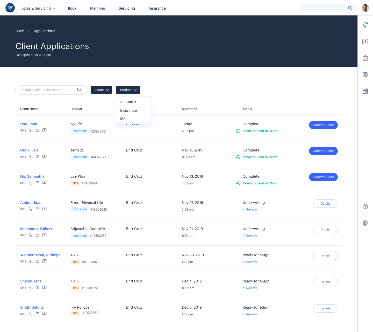
The landing page for all insurance and investment products and servicing functions. Before this, users had to enter product-specific systems, re-entering data repeatedly as they moved across the workflow.
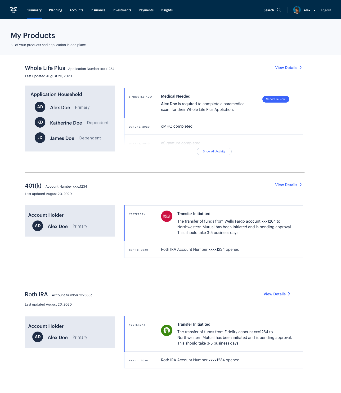
On the client’s side, providing transparency and consistency across all touchpoints and products, whether it’s at an individual or household level with multiple products at play. Previously, clients were mostly left in the dark when it came to monitoring and tracking applications.
This would serve as a place to track insurance and investment applications.
PRIOR STATE
Paper applications, redundant data entry, inefficient communication, cumbersome, unstable legacy systems. The multi-year initiative to modernize the entire purchase journey was and is highly complex but an important win.